


Table of contents
- 1. HTML <dialog> tag
- 2. Popover
- 3. WebGPU
- 4. Container Queries
- 5. Color Mix
- 6. CSS Nesting
- 7. Color Fonts
- 8. Web Vitals Extension For Chrome
- Now let's talk about some javascript features
- 9. Javascript Array.at(-1)
- 10. Javascript structuredClone() method
- 11. Transform Stream
- 12. Import Maps
- 13. JSON Modules of TC39 proposal
- 14. Transform Props
- 15. Trig Functions
- 16. Initial Letter
- 17. Viewport Units
- 18. focus-visible:
- 19. Inert
- 20. View Transition API
- 21. Animation Timeline
1. HTML <dialog> tag
The web is constantly evolving, with new HTML elements being introduced to enhance the user experience. One such addition is the <dialog> HTML tag, which provides a native way to create modal dialogs within web applications. In this blog post, we'll delve into the details of the <dialog> tag, understand its usage, explore some practical examples, and discuss the browser support it enjoys.
Understanding the <dialog> Tag: The <dialog> tag is an HTML5 element that represents a dialog box or a modal window within a web page. It allows developers to create interactive and contextual dialogs, such as alert boxes, confirmation dialogs, or custom pop-up windows, without relying on external libraries or frameworks.
Usage and Syntax: To utilize the <dialog> tag, you first need to define it within the HTML structure. Here's an example of the basic syntax:
<dialog id="dialog">
     <h2>Welcome to My Web App</h2>
     <p>Thank you for visiting! Enjoy your stay.</p>
</dialog>
In this example, we create a dialog with the id attribute set to "dialog" and include some content within the <dialog> tags.
Opening and Closing the Dialog: To open the dialog, you can use showModal method of dialog by accessing it using its id. To close the dialog, you can call the close() method on the dialog element accessing it by its id. Here's an example:
<dialog id="dialog">
     <h2>Welcome to My Web App</h2>
     <p>Thank you for visiting! Enjoy your stay.</p>
     <button onclick="dialog.close()">Close</button>
</dialog>
<button onclick="dialog.showModal()">Open Dialog</button>
Styling the Dialog: The appearance of the dialog box can be customized using CSS. By default, most modern browsers provide a simple and minimalistic design for the dialog box. However, you can override the default styles and apply your own to match the look and feel of your web application. We can also add animations to dialog element. Here is an example:
HTML file:
<!DOCTYPE html>
<html lang="en">
<head>
    <meta charset="UTF-8">
    <meta name="viewport" content="width=device-width, initial-scale=1.0">
    <title>Exploring Dialog tag</title>
    <link rel="stylesheet" href="style.css">
</head>

<body>
    <div class="wrapper">
        <dialog id="dialog">
            <form method="dialog">
                <h2>Welcome to My Web App</h2>
                <p>Thank you for visiting! Enjoy your stay.</p>
            </form>

            <button onclick="dialog.close()">Close via btn</button>
            <button type="submit" form="dialog" onclick="dialog.close()">Close via form</button>
        </dialog>

        <button onclick="dialog.showModal()">Open Dialog</button>
    </div>
</body>
</html>
CSS file:
body {
  height: 100vh;
  width: 100vw;
  overflow: hidden;
}

button {
  background-color: #1b1c1d;
  border: none;
  color: white;
  padding: 15px 32px;
  text-align: center;
  text-decoration: none;
  font-size: 16px;
  cursor: pointer;
  border-radius: 5px;
  margin: 5px;
  transition: all 0.2s ease-in-out;
  z-index: 1;
}

.wrapper {
  display: flex;
  flex-direction: column;
  align-items: center;
  justify-content: center;
  height: 100%;
}

dialog::backdrop {
  background-color: rgba(27, 28, 29, 0.945);
}
dialog {
  opacity: 0;
  scale: 0;
  display: block;
  transition: all 0.2s ease-in-out;
}
dialog[open] {
  opacity: 1;
  scale: 2;
}
OUTPUT:


Browser Support: The <dialog> tag enjoys decent support across modern web browsers. Here's a summary of its browser compatibility as of the time of writing:
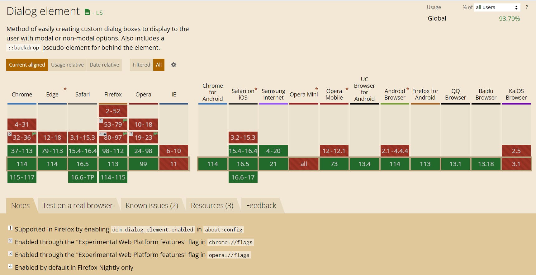
For older browsers that do not support the <dialog> tag, it will be treated as an unknown element and can be styled accordingly using CSS. Additionally, a JavaScript polyfill like "dialog-polyfill" can be used to provide a fallback implementation for unsupported browsers.
2. Popover
Building popovers, such as menus, toggletips, and dialogs, in browsers can be a complex task. However, a new set of declarative HTML APIs is being introduced to simplify this process, starting with the popover attribute in Chromium 114. This attribute allows developers to harness the browser's capabilities for managing focus, open/close states, and keyboard bindings, making popover creation more straightforward and efficient. In this point, we will explore the features and usage of the popover attribute, its benefits, and clarify its differences from modal dialogs.
Simplifying Popover Creation with the Popover Attribute: The popover attribute is designed to streamline the creation of popovers in web applications. By leveraging this attribute, developers can offload the complexity of managing various aspects of popovers to the browser itself. Here are some key features and concepts associated with the popover attribute:
As of today, this feature is experimental so in order to use it you need to enable "Experimental Web Platform features" in your browser:

Basic Popover Structure: To create a basic popover, you need to add the popover attribute to the element containing the popover content. Additionally, you assign an ID to this element and use a popovertarget attribute with the value of the popover's ID on the element that triggers the popover.
  <button popovertarget="poppinoff" popover-trigger="hover">Open</button>
      <div id="poppinoff" popover>
      <p>The feature be poppin'</p>
  </div>
Supported Functionality: The popover attribute supports several essential functionalities, including promotion to the top layer, light-dismiss functionality, default focus management, accessible keyboard bindings, and accessible component bindings. These features ensure that popovers are accessible and can be interacted with efficiently by users.
Explicit and Implicit Popovers: By default, a popover with a popovertarget will toggle open and closed automatically. However, explicit popovers can be created using popovertargetaction. This allows developers to have more control over popover behavior and tailor it to specific requirements. Manual popovers do not force close any other element type and do not close via light-dismiss.
CSS Anchoring: The popover attribute can be combined with CSS anchoring techniques to ensure that the popover is always anchored to its toggle trigger. This provides a consistent and visually pleasing experience for users.
Popover Attribute vs. Modal Dialogs: While the popover attribute can be used to create modal dialog-like experiences, it's important to note that there are key differences between the two. Modal dialogs typically have a higher level of interaction and restrict user input to the dialog itself until it is closed. Popovers, on the other hand, allow users to interact with other elements on the page while the popover remains open.
Benefits and Future Capabilities: The introduction of the popover attribute is part of a broader effort to enhance web application development by providing declarative APIs. These APIs aim to simplify complexity, improve accessibility, and make building web applications more manageable. The popover attribute is just the beginning, and more capabilities are expected to be added in the future.
3. WebGPU

WebGL has been the go-to solution for rendering 3D graphics on the web for over a decade. However, with the ever-increasing demand for more advanced graphics and compute capabilities, a new technology called WebGPU is emerging as its successor. WebGPU is a low-level graphics and compute API designed to provide modern, efficient, and cross-platform access to the underlying GPU hardware. In this blog post, we will explore the features and advantages of WebGPU over WebGL and discuss its potential to revolutionize web graphics rendering.
Enhanced Performance and Efficiency: One of the key advantages of WebGPU is its focus on performance and efficiency. Unlike WebGL, which is based on the OpenGL ES standard, WebGPU is designed to leverage the capabilities of modern GPUs more directly. This lower-level access allows developers to achieve better performance and more fine-grained control over the rendering pipeline, resulting in smoother and more responsive graphics.
Cross-Platform Support: WebGPU aims to be a cross-platform API that works consistently across different devices and operating systems. While WebGL has varying levels of support and performance across different browsers, WebGPU aims to provide a standardized interface that works seamlessly across platforms. This will enable developers to create high-quality, immersive graphics experiences that perform consistently on a wide range of devices.
Support for Advanced Graphics Features: WebGPU introduces several new features and capabilities that go beyond what WebGL offers. These include support for ray tracing, virtual reality (VR), augmented reality (AR), machine learning, and more. By exposing these advanced graphics and compute capabilities, WebGPU opens up a world of possibilities for creating visually stunning and interactive web experiences.
Safety and Security: WebGPU also emphasizes safety and security. The API is designed with security in mind, implementing measures to prevent potential security vulnerabilities associated with low-level access to the GPU. Additionally, WebGPU incorporates modern memory management techniques, reducing the risk of crashes and memory-related issues.
Community and Adoption: WebGPU is developed as a collaborative effort between major browser vendors, including Apple, Google, Microsoft, and Mozilla. This collaborative approach ensures that the API is designed to meet the needs of developers and is supported across a wide range of browsers. The WebGPU community is growing rapidly, with active discussions, contributions, and ongoing development to refine and expand the capabilities of the API.
4. Container Queries

Container queries are an exciting new addition to CSS that revolutionize how we apply styles based on the size of an element's container. Instead of relying solely on media queries, which are based on viewport size, container queries allow us to target elements based on the dimensions of their containers. This offers more granular control and enables components to adapt dynamically to different container sizes.
To use container queries, we first need to establish a containment context on an element. This is done by applying the container-type property with a value of size, inline-size, or normal. This tells the browser that we intend to query the dimensions of the container later on.
Consider the following example:
<div class="post">
  <div class="card">
    <h2>Card title</h2>
    <p>Card content</p>
  </div>
</div>
You can create a containment context using the container-type property:
.post {
  container-type: inline-size;
}
Once we have a containment context, we can define container queries using the @container at-rule. This rule applies styles to elements based on the size of the nearest ancestor with a containment context. We can also give a name to a containment context using the container-name property, allowing us to target a specific container in a @container query.
In the example below, a larger font size will be applied to the card title when the container's width exceeds 700px:
/* Default heading styles for the card title */
.card h2 {
  font-size: 1em;
}

/* If the container is larger than 700px */
@container (min-width: 700px) {
  .card h2 {
    font-size: 2em;
  }
}

.post {
  container-type: inline-size;
  container-name: sidebar;
  /* Shorthand container syntax */
  /* container: sidebar / inline-size; */
}

@container sidebar (min-width: 700px) {
  .card {
    font-size: 2em;
  }
}
Container query lengths units
When applying styles to a container using container queries, you can use container query length units. These units specify a length relative to the dimensions of a query container. Components that use units of length relative to their container are more flexible to use in different containers without having to recalculate concrete length values.
The container query length units are:
cqw: 1% of a query container's widthcqh: 1% of a query container's heightcqi: 1% of a query container's inline sizecqb: 1% of a query container's block sizecqmin: The smaller value of eithercqiorcqbcqmax: The larger value of eithercqiorcqb@container (min-width: 700px) { .card h2 { font-size: max(1.5em, 1.23em + 2cqi); } }
It's worth noting that container queries are still a relatively new feature and not fully supported in all browsers. However, for browsers that don't yet support container queries, we can use CSS grid and flexbox to achieve a similar effect. By using these layout techniques, we can create responsive components like the card component mentioned in your example, adapting their size and arrangement based on the available space.
Read more about container queries here
5. Color Mix
The color-mix() functional notation in CSS is a powerful feature that allows developers to mix two color values and obtain the result of the mix in a specified colorspace. It provides a flexible way to create interesting color effects and transitions on web pages. Let's take a closer look at the syntax and usage of color-mix().
Syntax of color-mix(): The syntax of color-mix() includes the following values:
color-mix(color1, color2, colorspace, hue-interpolation-method, [percentage1], [percentage2])
color1 and color2: These are the two color values that will be mixed together. They can be any valid CSS color value, such as hexadecimal, RGB, HSL, or named colors.
colorspace: Specifies the colorspace in which the mix will be performed. This can be one of the predefined color spaces supported by CSS, such as sRGB, linearRGB, or lab.
hue-interpolation-method: Specifies how the hue values of the colors will be interpolated during the mix. The available options are linear, clock-wise, counter-clockwise, shortest, and longest.
percentage1 and percentage2 (optional): These values indicate the amount of each color to be mixed. They are expressed as percentages and determine the ratio of each color in the final mix. If not provided, an equal distribution (50% each) is assumed.
Usage of color-mix(): To use the color-mix() functional notation, you can apply it to any CSS property that accepts a color value. Here's an example of its usage:
.element {
  background-color: color-mix(red, blue, sRGB, linear, 30%, 70%);
}
In this example, the background-color of the .element will be a mix of red and blue colors, performed in the sRGB colorspace using a linear hue interpolation method. The resulting mix will contain 30% red and 70% blue, creating a unique color blend.
6. CSS Nesting
CSS Nesting is a feature that enables developers to nest CSS rules within their parent selectors. This nesting mimics the HTML structure and helps organize styles in a hierarchical manner. Previously, developers had to rely on preprocessors like SCSS to achieve this nesting functionality. However, with CSS Nesting becoming a native feature, it is now possible to utilize this powerful technique directly in CSS.
Browser Support:

Benefits of CSS Nesting:
Improved Code Organization: CSS Nesting allows developers to group related styles together, making it easier to locate and modify specific styles. Instead of scattering styles across the stylesheet, nesting brings them closer, reducing code redundancy and enhancing code organization.
Enhanced Readability: By mirroring the HTML structure, nested CSS rules provide better context and readability. Developers can easily identify the relationship between selectors and understand the hierarchy of styles, resulting in more maintainable and intuitive code.
Modular Stylesheets: Nesting promotes modularity in CSS. Styles that are specific to a particular component or section can be grouped together within a parent selector, encapsulating them and making stylesheets more modular and reusable.
Efficient Media Query Integration: CSS Nesting simplifies the integration of media queries. Previously, developers had to repeat selectors for different media queries, leading to redundant code. With nesting, media queries can be nested within the corresponding selector, reducing duplication and enhancing efficiency.
Using CSS Nesting: CSS Nesting utilizes the nesting selector syntax, which includes the & character to refer to the parent selector. Here's an example of how CSS Nesting can be applied:
.parent {
  /* Parent styles */

  & .child {
    /* Nested child styles */
  }

  & .sibling {
    /* Nested sibling styles */
  }
}
In the above example, the .child and .sibling styles are nested within the .parent selector using the & syntax. This approach provides a clear and concise representation of the hierarchical relationship between selectors.
7. Color Fonts
Color fonts, also known as chromatic or multicolor fonts, are typefaces that incorporate graphic properties within the font file itself. Unlike traditional fonts that consist of outline shapes, color fonts include additional information such as bitmap images, vector shapes, gradients, textures, and even animations. These fonts break free from the limitations of monochromatic glyphs, allowing designers to unleash their creativity and explore new visual possibilities.
Visual Interest: Color fonts offer a visually engaging typography experience, allowing designers to captivate their audience with vibrant colors, gradients, and textures. By leveraging these elements, you can create eye-catching headlines, logos, and other textual elements that demand attention.
Personalization: Color fonts provide an excellent opportunity to infuse your design with personality and establish a unique brand identity. By incorporating specific color schemes and visual styles into your typography, you can reinforce brand recognition and create a cohesive visual experience.
Accessibility: Color fonts are compatible with assistive technologies, making them accessible to users with disabilities. They can be read by screen readers and support copy-and-paste and find-in-page functionality, ensuring that your content remains inclusive and available to all users.
Considerations when Using Color Fonts:
Scalability: While color bitmap fonts can scale correctly up to a specific size, they may appear pixelated beyond that point. It's essential to test and optimize the font size to maintain optimal visual quality.
File Size: Color font files tend to be larger than traditional fonts due to the additional graphical information they contain. Consider the impact on page loading times and choose the appropriate file formats and compression techniques to mitigate this issue.
Contrast and Legibility: Ensure that your color fonts maintain sufficient contrast against the background to ensure readability. Test the font on different devices and screen sizes to verify its legibility across various contexts.
Utilizing Color Fonts:
Selection: Choose color fonts that align with your design objectives and complement your overall aesthetic. Many reputable font foundries and online platforms offer a wide range of free and premium color fonts to choose from.
Implementation: Incorporate color fonts into your web designs using the
@font-facerule in CSS. Import the font file and apply it to the desired web elements to enjoy the visual richness it offers.Balance and Contrast: Avoid overusing color fonts and ensure that they harmonize with the overall design. Pay attention to the contrast between the font and the background to maintain legibility and readability.
8. Web Vitals Extension For Chrome

As web developers, we strive to deliver exceptional user experiences by optimizing the performance of our websites. To aid in this endeavor, Google has introduced the Web Vitals extension, a powerful tool that allows developers to assess and diagnose performance issues directly from the browser. We will explore the features of the Web Vitals extension, understand how it works internally, and discover how it helps identify specific elements causing performance bottlenecks.
The Web Vitals extension is a browser extension available for Google Chrome that integrates with the Chrome DevTools. It provides real-time insights into various performance metrics, helping developers measure, analyze, and improve the user experience of their web applications. The extension focuses on three core web vitals metrics: Largest Contentful Paint (LCP), First Input Delay (FID), and Cumulative Layout Shift (CLS).
Key Features of the Web Vitals Extension:
Performance Analysis: The Web Vitals extension displays comprehensive performance metrics for individual pages, allowing developers to assess the overall performance of their website. It provides insights into LCP, FID, and CLS scores, along with detailed breakdowns and suggestions for improvement.
Element-Level Performance Tracking: One of the most powerful features of the Web Vitals extension is its ability to pinpoint specific elements causing performance issues. By selecting an element on the page, developers can analyze the associated metrics, such as element-level LCP, FID, and CLS scores, helping them identify and address performance bottlenecks more effectively.
Real-Time Monitoring: The extension constantly monitors web vitals metrics as users interact with the website, providing real-time feedback on performance changes. This feature enables developers to identify performance regressions and quickly take corrective actions.
Diagnostic Information: The Web Vitals extension offers diagnostic information and actionable recommendations to help developers understand the underlying causes of performance issues. It suggests best practices and optimizations specific to the identified problems, empowering developers to make informed decisions for improving performance.
How the Web Vitals Extension Works: The Web Vitals extension leverages the browser's native Performance API, which captures various performance metrics during page loading and user interactions. It utilizes this data to calculate the LCP, FID, and CLS scores. By analyzing the timing and interaction data collected by the Performance API, the extension identifies the elements responsible for specific performance issues.
When a developer selects an element using the extension's inspection tool, it uses various techniques, such as element size and position tracking, event handling, and DOM mutation monitoring, to determine the element-level performance metrics. These metrics provide granular insights into how individual elements impact overall page performance.
Now let's talk about some javascript features
9. Javascript Array.at(-1)
The Array.at() method is a relatively new addition to JavaScript, it allows you to access an element from an array by using a negative index, effectively retrieving elements from the end of the array.
To access the last element of an array using Array.at(-1), you can follow this code example:
const arr = ['apple', 'banana', 'orange'];
const lastElement = arr.at(-1);
const secondLastElement = arr.at(-2);
const thirdLastElement = arr.at(-3);

console.log(lastElement); // Output: 'orange'
console.log(secondLastElement); // Output: 'banana'
console.log(thirdLastElement); // Output: 'apple'
10. Javascript structuredClone() method
It allows you to create a deep copy of an object, including complex data types like dates, regular expressions, and more.
To use the structuredClone method to copy an object, you can follow this code example:
const obj = { name: 'John', age: 30 };
const copy = structuredClone(obj);

console.log(copy); // Output: { name: 'John', age: 30 }
In the above example, we have an object obj with properties name and age. By calling structuredClone(obj), we create a deep copy of the object and assign it to the copy variable. The copy object will have the same properties and values as the original obj.
Before the introduction of the structuredClone method, deep copying an object in JavaScript was a bit more complicated. Developers would typically use methods like JSON.stringify and JSON.parse to accomplish this. Here's an example of how it was done before the structuredClone method:
const obj = { name: 'John', age: 30 };
const copy = JSON.parse(JSON.stringify(obj));

console.log(copy); // Output: { name: 'John', age: 30 }
In the previous approach, JSON.stringify(obj) converts the object to a JSON string representation, and JSON.parse() then parses the JSON string back into an object, effectively creating a deep copy. However, this method has some limitations. It doesn't support complex data types like dates, regular expressions, or functions. Additionally, it discards undefined properties, converts numbers to strings, and loses object references.
The structuredClone method, on the other hand, is designed to handle complex data types and create an exact replica of the original object, including all its properties and references.
11. Transform Stream
The TransformStream interface in the Streams API allows you to pipe the output of one fetch call into another. This can be useful when you need to transform or modify the data received from a server before sending it to another server or processing it further.
Here's an example of how you can pipe one fetch call into another using TransformStream:
// Create a new TransformStream
const transformStream = new TransformStream();

// Get the readable and writable ends of the transform stream
const { readable, writable } = transformStream;

// Create a fetch request
const request1 = fetch('https://api.example.com/data');

// Pipe the response from the first fetch call into the transform stream
request1
  .then(response => response.body.pipeTo(writable))
  .catch(error => console.error('Error:', error));

// Create a new fetch request using the transformed data from the first fetch call
const request2 = fetch('/api/endpoint', {
  method: 'POST',
  body: readable
});

// Process the response from the second fetch call
request2
  .then(response => response.json())
  .then(data => console.log('Data:', data))
  .catch(error => console.error('Error:', error));
In this example, we create a TransformStream and get its readable and writable ends. We then initiate a fetch request (request1) to retrieve data from an API endpoint. Instead of directly consuming the response, we pipe the response body into the writable end of the TransformStream.
The transform stream allows us to apply any necessary transformations or modifications to the data received from the first fetch call. These transformations can be defined by implementing a transform function that takes chunks of input data and produces transformed output data. The specifics of the transformation logic will depend on your use case.
Once the transformation is complete, we initiate a second fetch request (request2) using the transformed data from the readable end of the transform stream. This allows us to send the modified data to another server or process it further as needed.
By using TransformStream to pipe the output of one fetch call into another, you can efficiently handle data transformation and chaining of multiple asynchronous operations. This provides greater flexibility and control over how data is processed and transmitted in your application.
12. Import Maps
Import maps in JavaScript is a feature that allows you to declare a collection of JavaScript modules and their associated URLs all at once. It provides a way to map module specifiers to specific URLs, enabling you to easily manage and organize your module dependencies.
With import maps, you can define a map of module specifiers and their corresponding URLs in a JavaScript file called an "import map". This map acts as a central configuration for your module imports, making it easier to maintain and update module dependencies across your application.
Here's an example of how import maps are used:
// import-map.js
const importMap = {
  imports: {
    'module-a': '/path/to/module-a.js',
    'module-b': '/path/to/module-b.js',
    'module-c': '/path/to/module-c.js'
  }
};

// main.js
import { foo } from 'module-a';
import { bar } from 'module-b';
import { baz } from 'module-c';

// index.html
<script type="importmap" src="/path/to/import-map.js"></script>
<script type="module" src="/path/to/main.js"></script>
Using import maps offers several benefits. It centralizes and simplifies the management of module dependencies by providing a single configuration file. It also allows for easier refactoring and updating of module URLs since changes can be made in the import map without modifying individual import statements throughout the codebase.
Import maps are supported in modern browsers, but it's important to note that they are still considered an experimental feature and may not be available in all environments or older browsers. Therefore, it's recommended to check the browser compatibility before relying on import maps in production applications.
13. JSON Modules of TC39 proposal
The TC39 proposal we are referring to is called "JSON Modules" or "import assertions." It is an ongoing proposal to enhance the JavaScript module system by allowing direct importing of JSON data into JavaScript files.
Currently, in JavaScript, when you import a JSON file, it is treated as a regular JavaScript module. You need to explicitly parse the JSON data using JSON.parse() to access the actual JSON object. The JSON Modules proposal aims to simplify this process by enabling direct import of JSON as a first-class module type.
Here's an example of how JSON Modules would work:
// data.json
{
  "name": "John Doe",
  "age": 30,
  "city": "New York"
}

// main.js
import data from './data.json' assert { type: 'json' };

console.log(data.name); // "John Doe"
console.log(data.age); // 30
console.log(data.city); // "New York"
The JSON Modules proposal simplifies the process of importing and working with JSON data in JavaScript. It eliminates the need for explicit parsing and provides a more intuitive and streamlined way to import JSON into your code.
It's important to note that the JSON Modules proposal is still a stage 2 proposal in the TC39 process at the time of my knowledge cutoff. This means it is actively being discussed and evaluated, but it has not yet reached the final stage of standardization. As with any proposal, it may undergo changes before it becomes an official part of the JavaScript language. Therefore, it's crucial to stay updated on the status and adoption of the proposal in order to determine its availability in your specific JavaScript environment.
14. Transform Props
Now we also have individual CSS transform properties
.element {
  translate: 69% 0;
  rotate: 69deg;
  scale: 1.5;
}
it's important to note that the individual transform properties are part of the CSS transform property, which is supported by modern web browsers. However, older browsers may have limited or no support for these properties. Therefore, it's essential to consider browser compatibility and provide fallbacks or alternative approaches for older browser versions if needed.
15. Trig Functions
We have new trigonometric functions in CSS, which is incredibly useful if we have circles in our design.
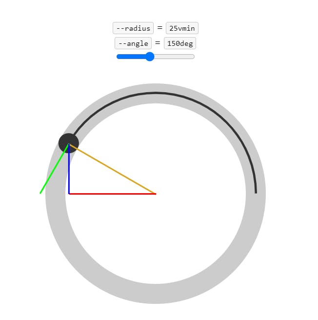
.circum-size {
    translate:
            calc(cos(30deg) * 100px)
            calc(sin(30deg) * 100px * -1);
}
The core three trig functions are:
cos(): Returns the cosine of an angle, which is a value between-1and1.sin(): Returns the sine of an angle, which is a value between-1and1.tan(): Returns the tangent of an angle, which is a value between-∞and+∞.
Read more here
16. Initial Letter
There is also a CSS property called initial-letter that allows us to manipulate the first letter of an article or block of text, similar to the way it is done in a magazine. By using the initial-letter property, we can increase the size of the first letter to create a visually appealing and attention-grabbing effect.
.article {
    initial-letter: 5 4;
}
Read more here
17. Viewport Units
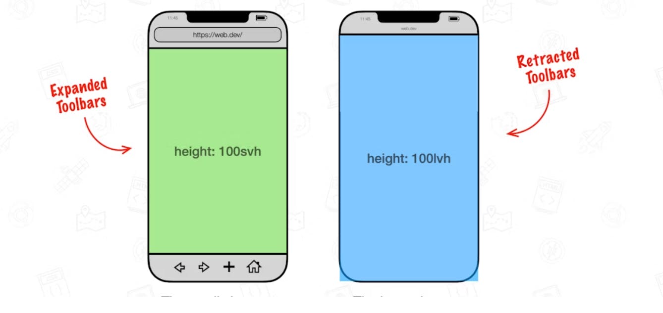
We also now have new viewport units specifically designed for mobile devices, which consider the presence of opened toolbars. These new units, such as lvh,lvw, svw and svh allow us to create layouts and designs that adapt seamlessly to different screen sizes, while taking into account the space occupied by toolbars when they are opened. This ensures that our web pages and applications remain fully responsive and optimized for mobile users, providing a better user experience.
.article {
    height: 100lvh;
    width: 100svw;
}
Read more here
18. focus-visible:
In the realm of accessibility, it's important to prioritize user experience for individuals who rely on assistive technologies or keyboard navigation. That's where the focus-visible pseudo-class comes into play. Unlike the traditional :focus pseudo-class, which applies styling to all focused elements, focus-visible specifically targets elements that receive focus from non-mouse inputs (such as keyboard navigation). This ensures that focus styles are only visible when they are needed, making the user interface more intuitive and reducing visual noise. By utilizing focus-visible, we can create a more accessible and inclusive experience for all users, especially those with disabilities or limited dexterity.
/* focus with tab key  */
.btn:focus-visible {
  outline: 2px solid darkkhaki;
}

/* mouse click  */
.btn:focus:not(:focus-visible) {
  outline: none;
}
19. Inert
The inert property is a new addition to CSS that allows us to indicate that certain elements are incapable of receiving focus or being interacted with. By applying the inert property to specific elements, such as static or non-interactive components, we can visually convey that they lack the ability to be focused on, eliminating any potential confusion for users. While the visual appearance may appear "boring" or less interactive, it serves as an important visual cue, making it clear to users that these elements are not intended for direct interaction. The inert property proves to be a valuable tool in managing focus and providing a more intuitive user experience by ensuring that interactive elements stand out while non-interactive ones gracefully recede into the background.
<div>
  <label for="button1">Button 1</label>
  <button id="button1">I am not inert</button>
</div>
<div inert>
  <label for="button2">Button 2</label>
  <button id="button2">I am inert</button>
</div>

/* CSS */
[inert] > * {
  opacity: 0.5;
}

20. View Transition API
The View Transition API is an exciting new addition to the web development landscape, offering the ability to create captivating page transitions that were previously only available in native mobile apps. With this API, developers can now achieve seamless and visually appealing transitions between pages in single-page applications (SPAs), with future plans to extend support to all same-origin pages.
The core animation effect provided by the View Transition API is a simple cross-fade between the current page and the incoming page. However, the true power of this API lies in its flexibility, allowing developers to create more complex and dynamic transitions using CSS or JavaScript. By taking snapshots of the current and incoming pages, developers can animate specific elements or layers separately, enabling a wide range of transition effects beyond simple fades.
It's important to note that the View Transition API is currently only partially supported in Chromium-based browsers. While this limits its immediate usability, developers can still experiment with the API and leverage it in controlled environments like Electron projects. As the web continues its journey toward offering native-like experiences, features like the View Transition API play a crucial role in making progressive web apps (PWAs) and websites feel more fluid and engaging.
The author recommends checking for API support and implementing fallback solutions for browsers that do not support it. However, they express a desire to avoid excessive JavaScript checks for legacy browser compatibility. Once full support for page-to-page transitions is available in at least one browser, it will become much easier to adopt the View Transition API by simply adding a small amount of CSS that can be safely ignored by legacy browsers. Until then, developers are encouraged to explore and prepare for the eventual widespread adoption of this exciting feature.
Read more here
21. Animation Timeline
The animation-timeline CSS property is a powerful feature that allows developers to control the progress of an animation by specifying a timeline. This timeline can be associated with the current position on a scrollbar, known as a scrollbar timeline.
There are two types of scroll timelines that can be used with the animation-timeline property: named scroll timelines and anonymous scroll timelines. A named scroll timeline is explicitly defined by applying the scroll-timeline-name property to an element and giving it a custom identifier. On the other hand, an anonymous scroll timeline is set using the scroll() functional notation. This notation indicates that the timeline is provided by some ancestor element of the current element.
The animation-timeline property can be set individually, or it can be included as part of the animation shorthand property. When set to none, the animation is not associated with any timeline. Setting it to auto means that the animation's timeline is determined by the document's default DocumentTimeline.
To provide a named scroll timeline, you can define a scroll timeline with a specific name using the scroll-timeline-name property on an element. For example, you can create a scroll timeline named squareTimeline on an element with the id container. Then, you can apply this named scroll timeline to an animation on the #square element using the animation-timeline: squareTimeline declaration.
For anonymous scroll timelines, you can use the scroll() functional notation to indicate that the timeline is provided by the nearest parent element that has a scrollbar. This notation allows you to animate an element based on the position of the scrollbar. The anonymous scrollbar timeline is applied to the element using the animation-timeline property.
It's important to note that the scroll() functional notation is still experimental, and browser support may vary. The examples provided demonstrate how to use both named and anonymous scroll timelines, allowing you to create more advanced and interactive animations that are synchronized with scroll positions.
Overall, the animation-timeline CSS property provides a powerful mechanism to control animations based on scroll positions, offering more flexibility and interactivity in web animations.
<style>
  /* Define a named scroll timeline */
  #container {
    scroll-timeline-name: squareTimeline;
    overflow: scroll;
    height: 200px;
    width: 200px;
  }

  /* Apply the named scroll timeline to the animation */
  #square {
    animation: moveSquare 3s infinite;
    animation-timeline: squareTimeline;
    background-color: red;
    height: 50px;
    width: 50px;
  }

  /* Define keyframes for the animation */
  @keyframes moveSquare {
    0% { transform: translateX(0); }
    100% { transform: translateX(300px); }
  }
</style>

<div id="container">
  <div id="square"></div>
</div>
In this example, we have a container element with the id container, which represents the named scroll timeline called squareTimeline. We set the scroll-timeline-name property on this element and give it a scrollbar by applying the overflow: scroll style. The container has a fixed height and width to demonstrate scrolling.
Inside the container, we have a square element with the id square. We define an animation called moveSquare using @keyframes, which moves the square from left to right. To associate this animation with the named scroll timeline, we set animation-timeline: squareTimeline on the square element. The animation is set to run indefinitely with animation: moveSquare 3s infinite.
As a result, the square element will move horizontally within the container as the scrollbar is scrolled. The animation is synchronized with the scroll position on the named scroll timeline, providing an interactive and dynamic effect.
You can experiment with this code and observe how the square element animates based on the scroll position within the container.
This blog is inspired by Fireship's video
If you found this blog helpful or inspiring, show your support by hitting the like button! ❤️
I'll keep bringing such type of content.